 As you know, AceProject was completely redesigned last year. The changes we made back then were greatly appreciated. However, since web apps evolve at a crazy pace, we’ve decided to pursue the makeover and take it to the next level. Needless to say that this Summer is going to be a busy one for our developers.
Once again, many irritants will disappear and actions will be easier to perform (such as user assignment to projects).
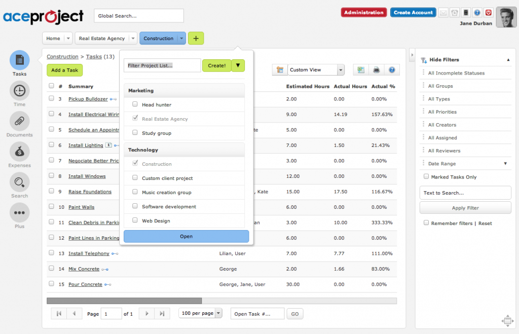
Four improvements will definitely stand out from others:
- The left menu will become graphical and much narrower.
- Filters will be moved to the right-hand side of lists.
- Actions will show up in a drop-down on every project tab.
- The “My Office” tab will be renamed as “Home”. This tab will include My Office’s content as well as the Portfolio’s, which will be removed.
A limited number of customers will be invited to join a beta program somewhere around September. These customers will get the chance to test drive the new design with their own, real data. Stay tuned!
Here’s a screenshot of our new look:

Great news indeed!
I like AP very much but suffer sometimes from the former/current interface.
The changes seems good for sure and I believe the AP team is doig a great job.
Currently, my usage of AP is under a free account. But I think these improvements will seduce me into a basic payed profile =]
Keep the good work going!
Arnaldo
I believe that the AP will benefit a lot of from the new features rolling out. The new look is really smart, more intuitive interface, making it faster, easier and more efficient to manage our daily projects.
Great work by the AP team!
Very nice improvements. Thanks…
All headings on the main page should be sortable. This would ceratinly enhance ACE and allow users to quickly see workload for a complete group of associates.
certainly
How can I become a beta tester?
Hello Paul,
We will be mass mailing account administrators when we are ready to begin the beta testing phase. All details will be provided at that point in time.
Michel Deslandes
Sales, Customer Service and Technical Support
Contact Us