With AceProject’s new version, we’ve been working on making it more usable. There were the big features, like task dependencies and the Portfolio tab, and there were the smaller features, like the user workload report.
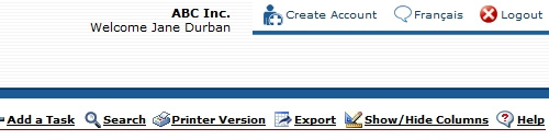
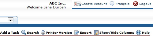
And finally, there’s Aceproject’s look and feel. MIchel, our graphic designer, had been asking to redo our icon set for a long time. With AceProject 4.7, he took on the challenge. And it was quite a challenge. There are over 100 icons in AceProject. We started with a good set of icons, and then, with time, as we added more and more features, we started loosing consistency in our icons.
It was time for a refresh.
Michel started by building a list of all the icons in the system, and then he created “icon concepts” like adding something, and “icon basics” like representations of tasks, projects, and users. He then put together the basics with the concepts, and the icons were born. Adding a task is the task icon with the + , just like creating an account is the account icon with a +. It makes things much easier to understand.
Here’s a close-up of the icons:
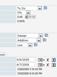
Before:
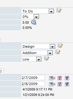
After:
The other place where the change is very visible is in the task itself:
Before: After:
A big change that is easy to live with
What surprised me when I saw Michel’s work integrated in the AceProject 4.7 was not how good it was (it was great), but how natural it was. I wasn’t struggling to figure out which icon did what, and I didn’t feel lost in an interface I had gotten used to over the years.
Kuddos to you, Michel!
Leave A Comment