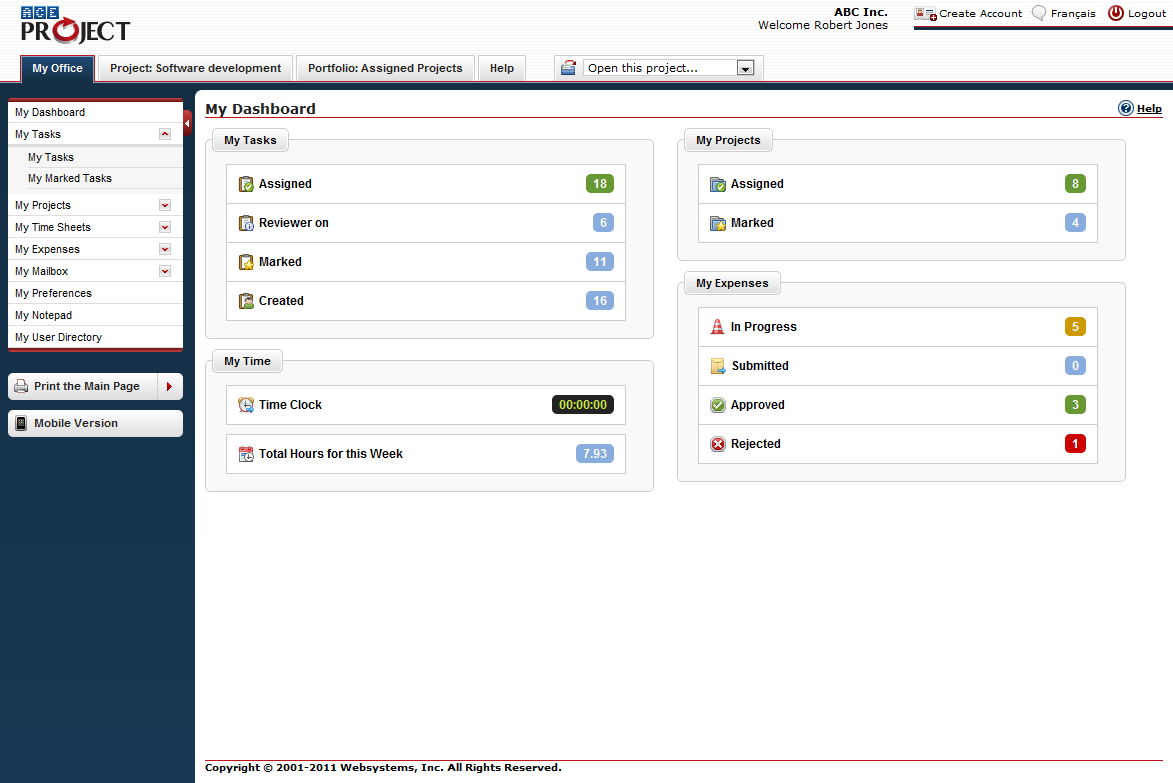
The dashboard’s launch is a milestone in AceProject’s history. To this day, it is one of the most requested features, and here it is.
At first glance, one might think adding a dashboard to AceProject is a piece of cake. However, given the way we put things into perspective, it was (and still is) a challenge. First of all, most dashboards are highly graphical, with pie charts, bar charts and all kinds of tables. We didn’t want to add graphs and charts just for the looks, and we were not too thrilled about providing data of no use in cool charts, only to provide eye candy.
That being said, we had to decide which data is really useful to AceProject users. We chose to separate that data by group (My Tasks, My Projects, My Time, and My Expenses) and show the number of corresponding items. As for graphs and charts, we have some plans that cannot be discussed at this time. Under “My Time”, you’ll notice the time clock running in real-time, when active.
We are really proud of this new feature. From now on, it will be the default page upon login in all accounts (unless a project is specified). We are confident that this page will remain or become the most used page in AceProject and hopefully, one of the most beloved.
Here’s a screenshot of the dashboard.

My experience has been that management likes:
> Red Light/Yellow Light/Green Light – with the ability to drill down on tasks and details to ID cause of slippage, etc
> Track due dates and slippage as it effects project completion date (ex Burndown Charts)
> The whiz-bang colored charts do add some value as they can be added to Powerpoint presentations and gives you a vehicle to talk to the details.
Hello Paul,
Thank you for your comments.
The dashboard we implemented is geared towards the end user which does not rule out the possibility that we will someday include charts such as the ones you mentioned.
Thank you for using AceProject!
Regards,
*Michel Deslandes* Sales, Customer Service and Technical Support Email: support@aceproject.com Live Chat: http://messenger.providesupport.com/messenger/aceproject.html Phone: +1.418.907.5184 / +1.866.259.2454 (US & Canada) Fax: +1.418.907.8089 Website: https://www.aceproject.com Blog: https://www.aceproject.com/blog Twitter: @AceProjectnow