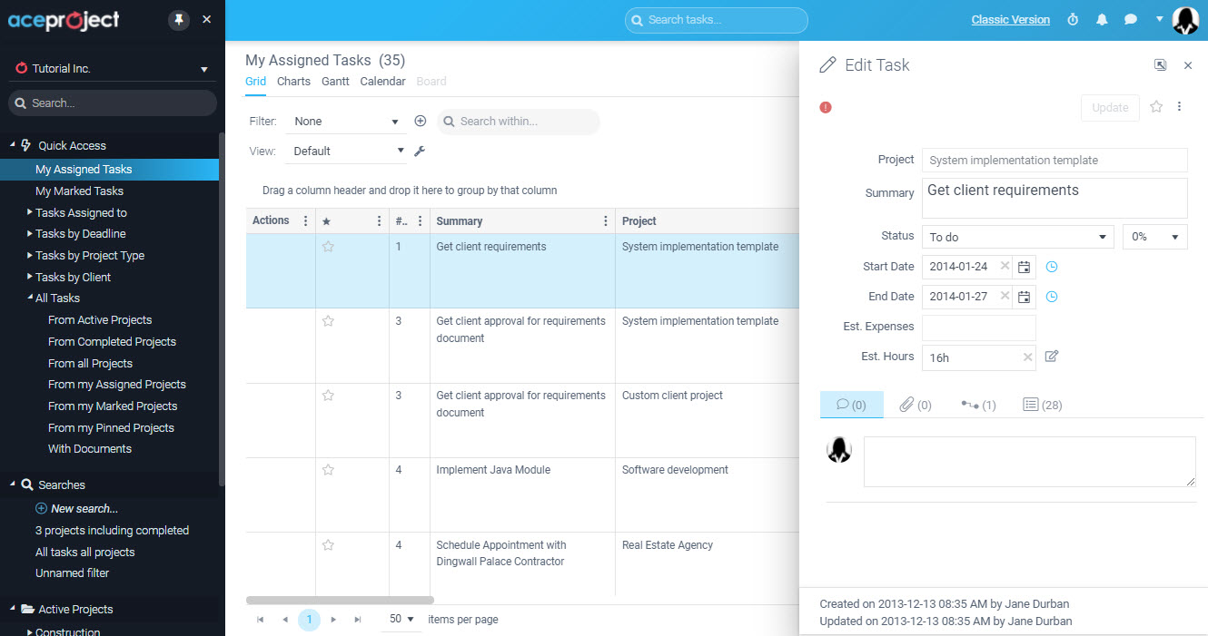
If you have not yet noticed, under your My Profile area by clicking on your avatar on the top right, you can choose between 2 theme offerings. The default “Light” theme, and a much more contrasted (and many have commented, cooler) “Dark” theme are available.
You may have noticed a “lightening” up of the interface for the “Light” theme, and much better use of contrast in the “Dark” theme. Previously, too many grey tones led to many users not being able to easily discern different zones of the application. 

Not only is access to a “Dark” theme cool, but there may also be health benefits depending on the lighting conditions and time of day that you work. If you suffer from eye fatigue, try switching themes and see if it makes a difference.
More features will be ported to the New interface as time goes on.
Leave A Comment